Google Jamboard
Mobile drawing
Jamboard is a visual collaboration tool for shared understanding
Led by the 55-inch whiteboard kiosk device, the ecosystem is backed by software for collaboration via web browser, as well as on mobile and tablet apps to brainstorm, flowchart, present, and conduct design sprints.
At the time, users could only draw on the whiteboard kiosk and tablet app
The mobile app supported only a subset of editing capabilities, limiting those users ability to collaborate.
55% app uninstall rate
Lacking drawing parity with the other Jamboard clients, this resulted in low app store ratings and user retention.
User opportunity
Raise Jamboard satisfaction by introducing drawing parity to the mobile app.
Business opportunity
Improve mobile app user retention rate and raise engagement on the Jamboard platform. Enhance sales team demos with the added drawing capabilities on mobile to help raise Jamboard kiosk sales.
Challenges
Scaling down the editing toolbar and maintaining a cohesive drawing experience between the phone and the 55” kiosk screens
Very limited design precedents across Google editor mobile apps for patterns to leverage
Aggressive two month timeline to hand off production ready designs
No UX researcher staffed to the project
My role
Defined user needs and collaborated with PM and ENG to scope the project
Lead UX and visual design
Lead research, developed a test plan, and conducted the testing sessions
Presented research findings and designs to stakeholders to achieve alignment on the solution
Defined user metrics
Developed relationships with the Google Material and Accessibility teams for their consultation to achieve compliance with Google design system standards
Supported engineering and QA teams during development and testing
My process
01
Define
Identified user stories and collaborated with PM and Eng to scope the project and prioritize features
02 Foundational r
esearch
Analyzed competitive drawing apps to understand user mental models and their UIs and interactions
03
Design exploration
Quickly iterated to solve for multiple aspects
Explored:
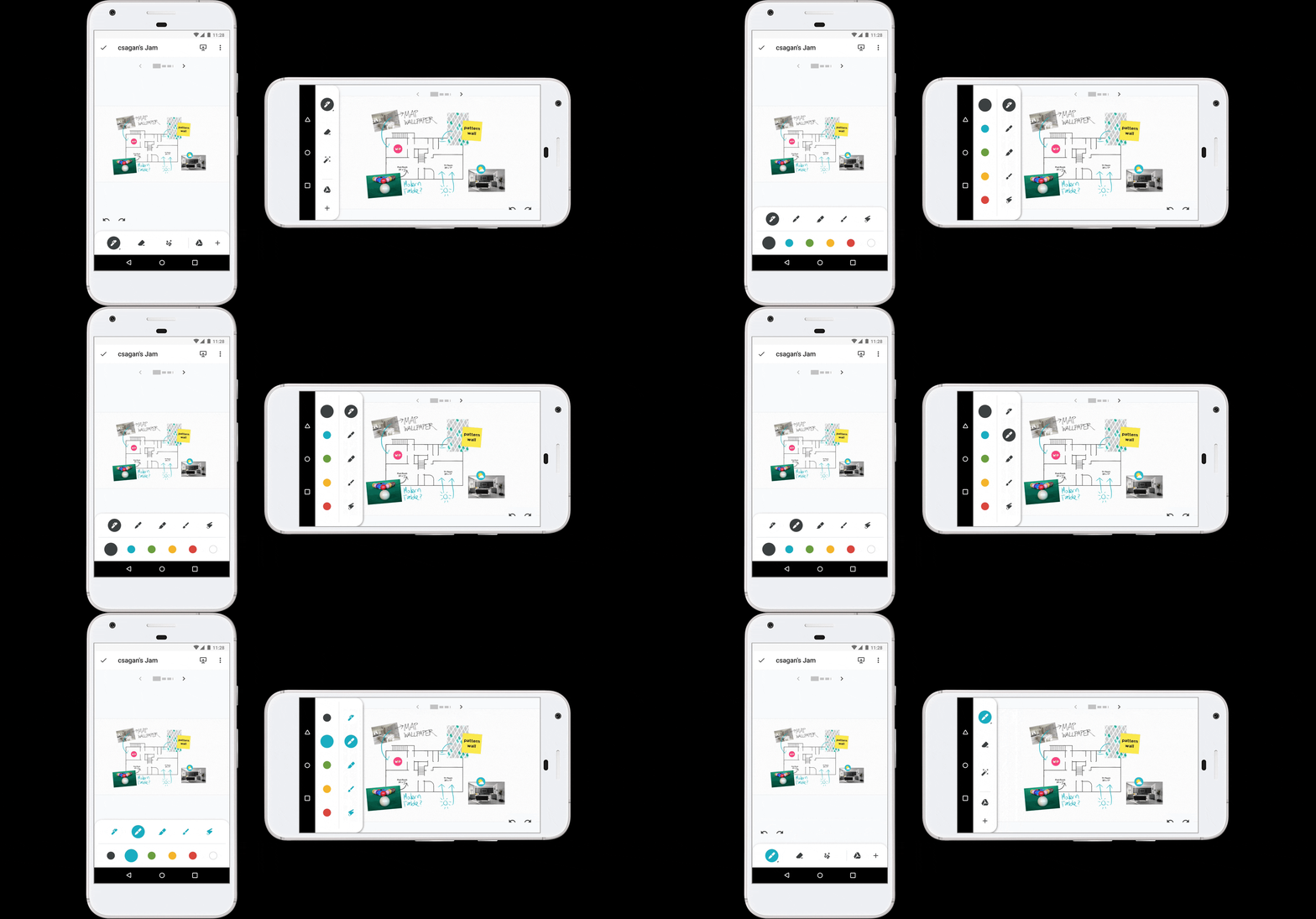
Scalability and display of tool menus in portrait vs landscape orientation
Clarity of tool functions
Canvas work area size at default scale and magnification views
Design principles established:
Give immediate access to drawing mode when a file is opened
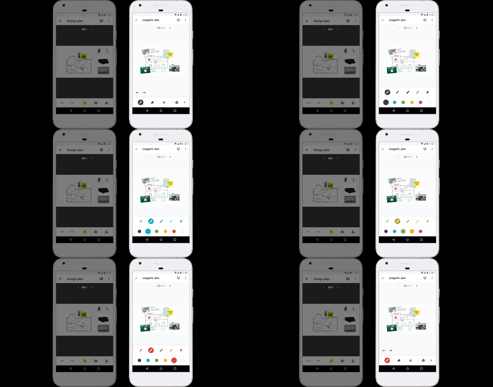
Provide strong visual affordance for the active tool
Maximize canvas work space size for a phone’s small screen size
04 Revise and r
efine
Applied design exploratory learnings
Refined design to three approaches to address these challenges:
Tool hierarchy and toolbar menu scalability
Active tool visual affordance
Maximizing canvas work space
Presented to stakeholders and received unanimous agreement on my recommendation for direction three for the following design rationale:
Strong visual affordance to indicate the active tool state
Provide the maximum amount of canvas work area in landscape orientation
Landscape toolbar layout avoids conflict with the existing delete affordance (located at the bottom center of the canvas frame)
05 Validate hypotheses
Developed a test plan and prototypes, then conducted the user tests
The design hypotheses tested very well
100% success rate in the discoverability of expanding and collapse the toolbar
100% success rate in the discoverability of the undo/redo buttons, with the majority saying its location is where they expect it
80% said that vertical toolbar landscape met their expectations. 80% also expected it to be persistently pinned to one side regardless of clockwise or counterclockwise device rotation.
06 Apply & socialize learnings
Synthesized results, applied test learnings, and socialized to stakeholders
07 Consult for compliance
Reached out to the Google Material Design team for a compliance review despite Jamboard's exception, to avoid future revisions
Final designs
Prioritization of drawing tools in toolbar
The color palette is nested in each tool for consistency with Google Keep
Tool grouping consistency with Jamboard kiosk
For consistency across clients the add content tools are grouped together. For tool discoverability the add from Google Drive action is surfaced as the default tool of that toolset since it’s only available on the phone app.
Contextual UI display to maximize work space
In landscape orientation the app bar is suppressed. Zooming in temporarily hides the navigation between canvases.
Design hand off & implementation
08 Annotate
Presented final designs to leadership. Created detailed design specs for implementation. Collaborated with a motion designer to spec animations.
09 Support
Collaborated with engineers on minor design revisions based on implementation challenges. Partnered with the QA team to ensure product quality.
Summary
Mobile users can collaborate with the same drawing tools as the kiosk device
The mobile toolbar lets you start drawing right away and easily switch back to drawing from any tool mode. It’s scalable menu clearly indicates the active tool in use.
55% increase in canvas size in landscape orientation
Suppression of UI elements in landscape orientation maximizes canvas size for drawing and editing
More selected works
© 2024 - Scott Galbraith


